Oryza Rice
PackagingResponse to Brief
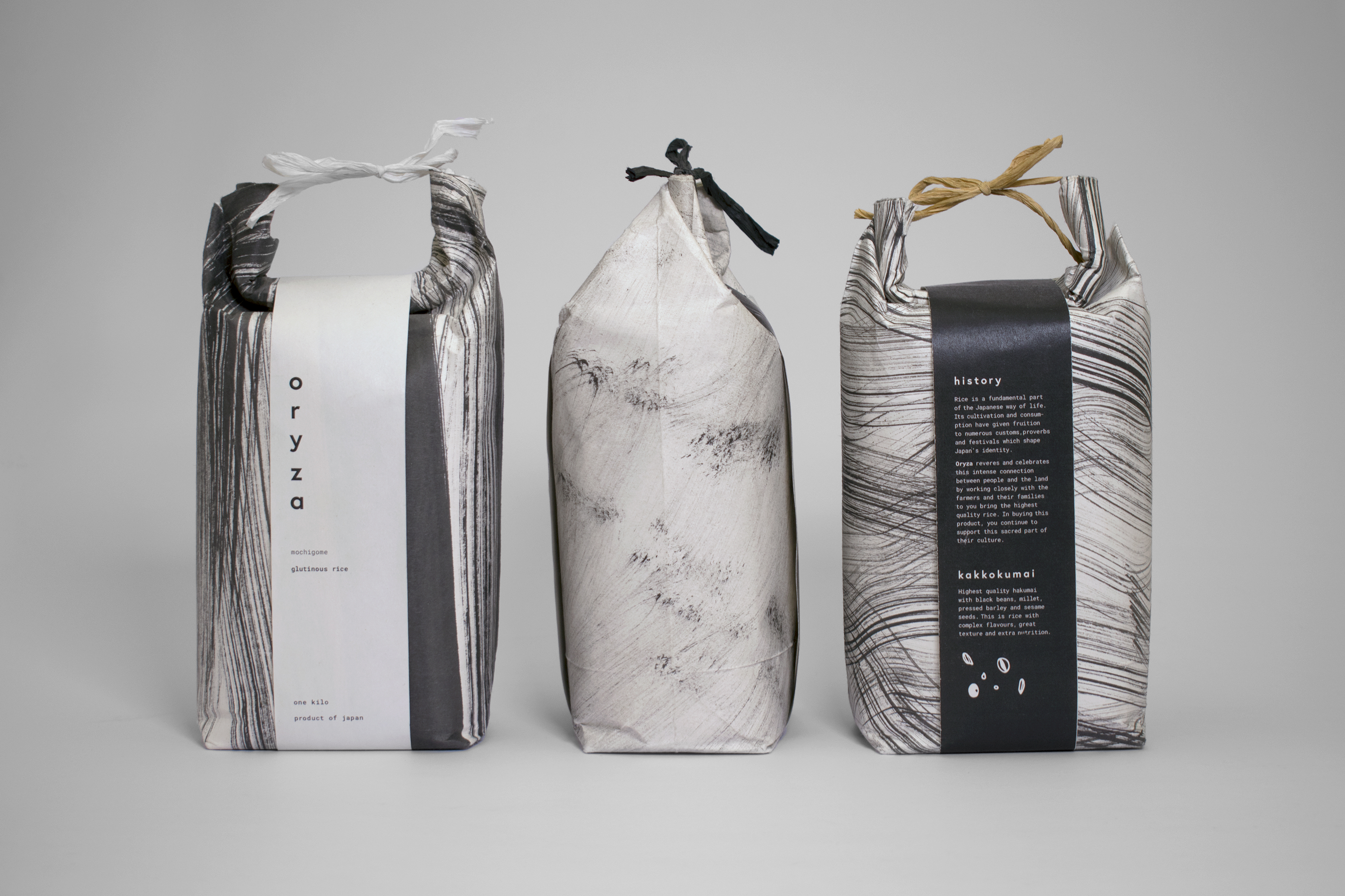
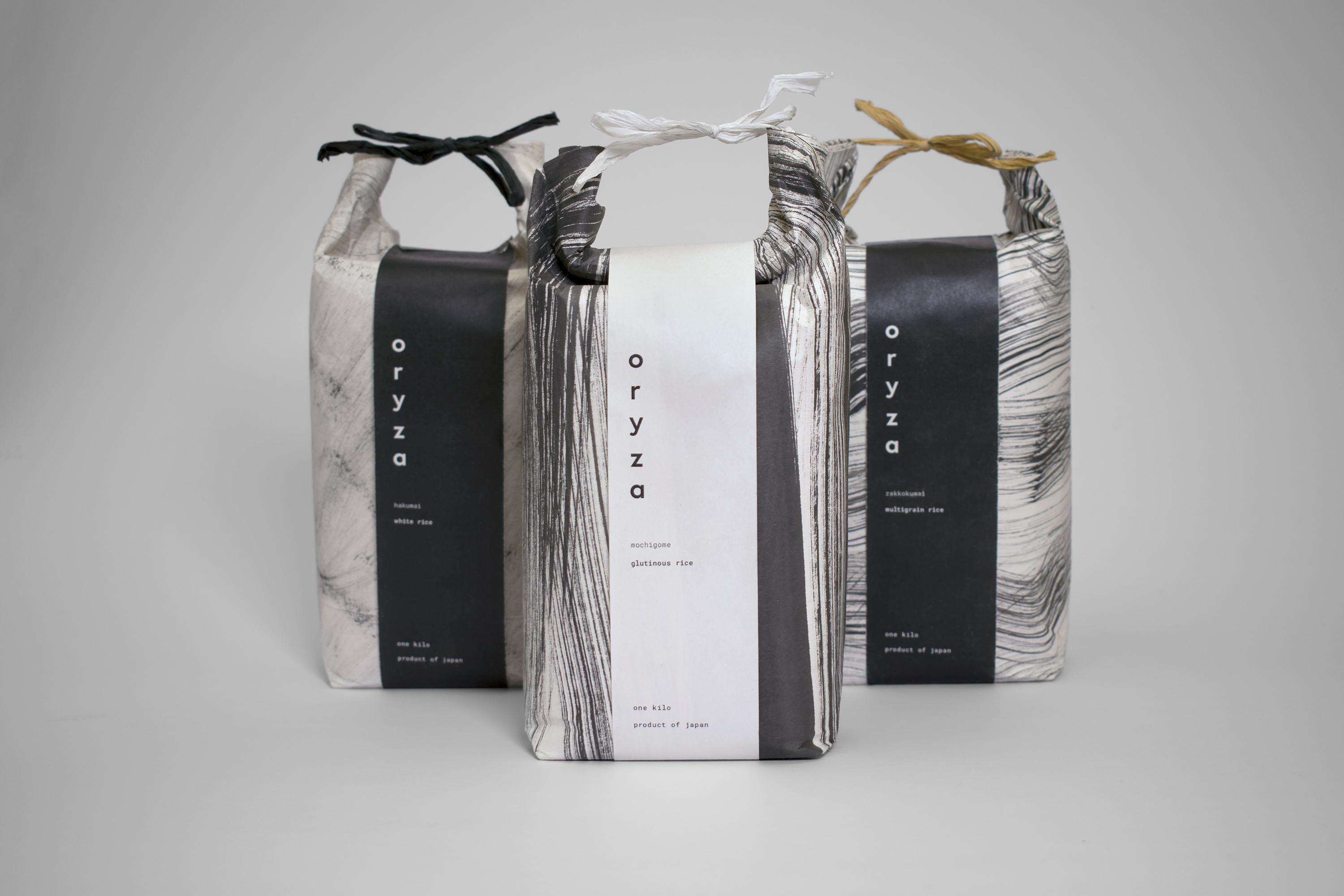
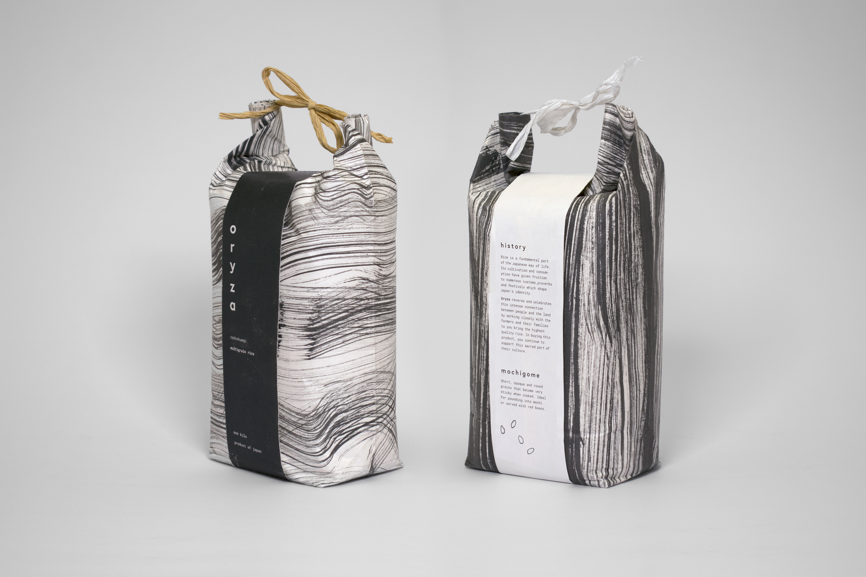
Rice is a fundamental part of the Japanese way of life. Its cultivation and consumption have given fruition to customs, festivals and proverbs that shape Japan’s identity. As such, the packaging aims to capture these deep-rooted connections through folding style, pattern design and typography. This aim also includes the use of Japanese tools such as brush and ink to create strokes that resemble the forms of the rice plant. The specific purpose of the rice has informed the appearance of the patterns. For example, hakumai (white rice) is shown as a light pattern while mochigome (glutinous rice) features several dense and heavy strokes to reflect the pounding actions involved with preparing mochi.
Role
Package design for set of products
Mark making
Pre-press
Photography
Awards
Featured in
Rice is a fundamental part of the Japanese way of life. Its cultivation and consumption have given fruition to customs, festivals and proverbs that shape Japan’s identity. As such, the packaging aims to capture these deep-rooted connections through folding style, pattern design and typography. This aim also includes the use of Japanese tools such as brush and ink to create strokes that resemble the forms of the rice plant. The specific purpose of the rice has informed the appearance of the patterns. For example, hakumai (white rice) is shown as a light pattern while mochigome (glutinous rice) features several dense and heavy strokes to reflect the pounding actions involved with preparing mochi.
Role
Package design for set of products
Mark making
Pre-press
Photography
Awards
- 2018 AGDA Student Awards / Distinction
- 2018 ADAA Awards / Finalist
Featured in


Making the pouch
Sustainability was a key consideration. The rice is packaged in a sturdy paper bag that references modern and historical examples of rice packaging. The choice of fold follows traditional design—a paper pouch with a roll top feature and paper rattan tie. When the contents are finished, the package can be reused as a gift bag.
I worked with my friend Mina Kang to produce a video about how to package the rice.